Friday, February 26, 2010

Still Life: Balsam Apple and Vegetables, ca. 1820s


James Peale (American, 1749–1831)
Oil on canvas; 20 1/4 x 26 1/2 in. (51.4 x 67.3 cm)

Maria DeWitt Jesup Fund, 1939 (39.52)
James Peale created this still life at the peak of his career. He typically used somber colors and forms, so the lavish, vividly colored vegetables in this work make it a tour de force.


Just randomly searched the Met website and came across this one. I don't have any particular favorite artists for still life. In this piece, I see a lot of vibrant movement. It is in the way that the light plays on the coloring going from the upper part of the piece with the dark green, leafy vegetable and drawing your eye down to the lower right with the bright red (pepper?). This creates movement even in a still life, which is remarkable. Also, for some reason the tint of the green is rather unappealing, and so is the yellow. Makes me wonder if he disliked those vergetables. Hehe.

Snow Day! What's due Tuesday?

Hello all,

Hope you're enjoying your snow day! We're falling behind fast, and at this rate I'm afraid we'll hardly have any time for still life. So I have added an assignment to introduce you to still life over the weekend. Remember those five thematically related objects I asked you to bring to today's class? Well I would like you to arrange them in a composition, on a neutral background, with a single light source if possible, and do three sketches of them. The first two should be closed compositions from two different angles, and should take you at least half an hour each. The third should be a closed composition and should take you at least an hour. All your drawings should be at least 8.5" x 11" (don't come with tiny sketches-- these should be more fleshed out).

So, to recap. For Tuesday's class you should bring:
-five thematically related objects
-two half hour closed composition sketches of these five objects
-one hour long, open composition sketch of the five objects

This will be part of your sketchbook grade.
Any questions, please contact me.

Thursday, February 25, 2010

Vincent Van Gogh's still life drawing


This piece is drawn by Vincent Van Gogh and he drew this in December 1881. I don’t know the title of this piece but I chose this artwork because I personally I Van Gogh’s work and it seemed to have some elements of art that we have been learning so far.

I think he chose dark because if he chooses dark background, the object will stand out. It is interesting that the artist also used different lines and shapes within the shading. It is also interesting that he used the gradation between the left parts of the piece to the right part. It goes light to dark. He used big object in the middle and smaller objects around which is cool.

still life 2-25-10


this piece is called "still life" and its by Giorgio Morandi. i chose this piece because it seemed to combine various elements of art that we have been studying. you can see in the top corners there are vertical lines of varying shades.
now that i look closer to the background i can see that there are different shapes within all the shading. they look like flowers to me, not sure though, its difficult to tell. there are even more shapes or designs in the shading closer to the bottom of the piece. very interesting idea. i wonder why morandi did this.
i especially think the contrast between the top part of the piece and the bottom part is interesting. it goes from light to dark which i think is cool. he does this as well with the two taller bottles in front of the basket. one is lighter than the other. i also find it interesting that he chose a tall and hourglass shaped bottle and have it next to another tall, but wider based bottle that is lighter in shade. then next to the basket theres a short bottle with a wide base. http://www.moma.org/collection/browse_results.php?criteria=O%3AAD%3AE%3A4079&page_number=4&template_id=1&sort_order=1

Blog Posts for This Week

I would like for everyone to look at still life for their blog post this week. Some artists to consider for still life are Georges Braques, Matisse, Dutch still life in general (from the 16th-18th c), Picasso, and Jean Simeon Chardin. Still life is a prevalent genre of painting in Western art with a rich tradition, so many of the artists you come across will likely be from the 16th-19th c, which is just fine for this assignment. Let me know if you have any problems.

Example:


Jean-Simeon Chardin, La Raie, 1725-26

Wednesday, February 24, 2010

butterfly

i really liked this drawing by Mark Grotijan one becasue of the use of color and how 3d it looks but because it is his differents takes on the butterfly. I always find it amazing how someone can take something and draw what they see and it willl always be completly diffferent then what someone else sees and then composes. the picture seems, even though it was drawn, that you could reach out and touch it. that it is real and protruding from the wall.

Tuesday, February 23, 2010

Portrait of a Man - Diego

This line drawing by Alberto Giacometti caught my eye because of how sloppy it looked. The lines look as if they were drawn very quickly. Areas where a lot of these lines overlap are darker, adding contrast and depth. Giacometti didn't seem to focus on the shoulders very much but on second thought this was probably done on purpose. The focus of the piece is the face and the different line strokes used to depict those features and if a lot of lines were used for the shoulders, it might take the focus away from the face. Instead Giacometti uses long straight-ish lines to give the shoulders an outline and the rest is left to the imagination. I really like these types of drawings and seeing this piece by Giacometti showed me new ways of branching away from representational drawing and more towards using different line qualities to let the brain interpret shape and depth.
I really admire the room filled with pictures of the boy who had a tumor and his mother's journey as she tried to be there for him through every moment of his life. All the pictures were black and white, as I recall, and it was easy to see outlines of the people and the boy's stick-like arms whenever he and his mother were hugging or when she was racing his wheelchair down the hall before his chemotherapy treatment began. this was a very powerful exhibition, it takes inner courage to document moments of someone's life like that and put it up on display. I was truly touched.

Due Friday, 2/26


For Friday's class, I would like you to bring in a set of at least five objects that are thematically connected. We will be using these objects to create a class still life (only for one class period-- you will take the objects back with you at the end of the session). Try to bring in a variety of sizes of things that fit within your theme. For example, if your theme is "things that are shiny," rather than bringing in five gum wrappers, bring in a large shiny pinwheel, your new bicycle, a mirror, a disco ball, and an irridescent porcelain cat. Just an example. Other ideas for themes are "things that are made of glass," "things that are rough," "things that are soft," "things that are organic," -- you get the idea.

Monday, February 22, 2010

Last Wednesday was the first time i entered the Samuel Dorsky Museum and it was a fairly interesting experience. As you first walk in you see many different types of artworks from paintings to ceramics etc. Then as you make your way towards the back left one would see a whole gallery of photographs of this one child. When walking in and seeing the photographs the pictures had meaning to it. Every little detail was taken into account by the artist.The photographs go in order from day one to the last day the boy was alive. This was pretty interesting because it was not only one picture it was like the pictures told a story and the art had meaning to it.
Furthermore, the pictures were all in black and white which I found to be pretty interesting which may have been done for several reasons by the photographer. One could possibly be because he wanted everyone to look the same and color didn't matter in these pictures. In addition some of the pictures were very graphic and stimulated the viewers attention as you saw pictures of a small child with a huge tumor in his stomach. All in all I thought the museum was fairly interesting and I enjoyed strolling through it.
friday after class was my first time actually going inside and take my time looking at evrey piece carefully. the museum had many interesting art work but the one that really got my attencion out of all of them was "A Mother's Journey" by Renne C. Byer i really like how the photos could really tell the story and show so much emotion. i really like that piece over evrething else because i couldnt finish seeing all the pictures and reading the story. It was really sad i had a friend tell me the rest of the story. Also i agree that that really shows the reality of what many people go thru with loves ones who have cancer.

"A Mother's Journey"

When I was in the Dorsky I saw some great art, especially a piece in the permanent collection by Alberto Giacometti called Untitled. I really loved the photojournalism exhibit a little more. The reason is because some of the photographs were sweet and some of them were uncomfortable. It was not even the subject matter (such as the obvious hospital setting visual) so much as the angle, lines, and depth of the emotion taking place. There was one photograph in particular, I think #3 from the left. I believe it was when they were in her vehicle and she was on her cell phone(?). Anyway, the angle made me feel like I was intruding in the lives of these people.

Additionally the expressions on the faces both of the mother and the son were intriguing because sometimes he would be happy and she would be worried, or vice versa. It's also interesting because you would not think that photojournalism can have as much of an impact as a traditional piece such as Untitled by Giacometti, but it can, because of the method used when the photographer was taking their shots. They seemed very unplanned and spur-of-the-moment but yet deep, meaningful, and well thought out. I don't even remember the storyline as clearly as I remember the emotions evoked by the mother and her son on their journey through his illness and to his death.

Thursday, February 18, 2010

when I visited the Dorsky Museum, I looked at many of the pieces in the "Body, Line, Motion" exhibit. There were several interesting pieces, but the one that caught my eye the most was the "Portrait of a Man--Diego" by Alberto Giacometti. This piece was a drawing of a human head, from the shoulders up. What caught my eye the most was all the different lines that were used in the piece. There was more attention put to the face and the head than the shoulders and the neck. You can even tell that giacometti worked on the neck a couple of tiems, making it stand out. You can see the lines and the progression.
the face is definitely the boldest part of the piece. It stands out the most, especially with all the lines that were used to create the different parts of the face. I like how the lines used to make an outline of the circles for the eyes continues down into parts of the nose. This also put more emphasis in this area which draws the viewer's eye towards this area.

Museum

I saw Renée C. Byer’s photos. The pictures were very energetic. The pictures looked like they were sad or more like upset for some reasons. I felt little uncomfortable when I see them. Many of them were black and white. Also the subject and titles were shocking like ‘murdered parents’ and etc.

There was a picture that sick kid and his mother were hugging. It gave me uneasy and anxious feeling rather than peaceful or happiness. Its dark color, mother’s wrinkle and closed eyes were very effective. The child’s arms and position was making uncompleted hug and kind of diagonal lines. They were making it unstable. Its title is "The Sacramento Bee" by Renée Byer.

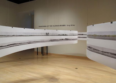
Panorama of Hudson River- Greg Miller

Although I've heard about Dorsky museum and lots of people asked me the directions of this building, I never been to Dorsky museum before. I was excited to see the artwork of the artists.
I went to Carolee Schneemann's section because it had many interesting artworks. I liked Caged cats 1&2 and hand/heart for Ana Mendieta but this photogragh caught my eyes. It is taken by Greg Miller in 2009. When I looked at this picture I could learn the historical differences between past and present times. I liked this piece because it shows the development of the hudson river. I know that Hudson river is really long and the artist must have spent many times taking this photographs.

Tuesday, February 16, 2010

Andy Warhol- 100 cans


I liked this pattern because it looks colorful.

He used oil paint in canvas. He created this piece in 1962.

This is an example of symmetrical composition because cans are placed in straight lines and if you divide the painting in half, you can see that each side is exactly the same.

This Week's Post

Hello All,

This week, rather than posting an image and a formal analysis on the blog, I would like you to visit the Samuel Dorsky Museum of Art here on campus. When you visit, focus on one exhibit (there are currently three going on), then pick one work of art that you respond to and write a two paragraph summary detailing
-what exhibit you saw
-how you felt about it
-what piece most caught your eye
-a brief formal description of that piece

All in all, this should take you less than one hour. At 11am after Friday's class, I will be going to the Museum and I invite you all the join me. It will be a good opportunity to respond to some artwork in the flesh rather than simply viewing images online.

As always, please contact me with any questions/concerns.

Best of luck on your drawings!

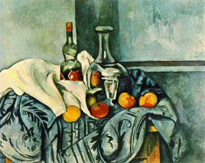
Cezanne


http://www.expo-cezanne.com/1_3.cfm?id=-1656112551

This is "Still Life with Peppermint Bottle" by Cezanne. It is painted during 1890- 94, size 65 x 81 cm, oil on canvas. It has bluish color all over and apple's bright colors hold my eyes. The white clothe is also helping its contrast. Some interesting patterns are making it lively.

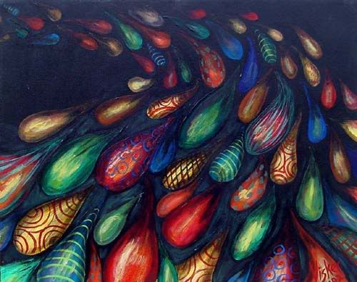
Photobucket

Judith Visker’s “Colored Rain” struck me as an interesting pattern painting. The droplets of ‘colored rain,’ which appear to swim like a shoal of brightly colored fish in a dark ocean, each contain their own pattern, at once just similar enough to another in the group to tie them all together, and just different enough to stand out against the darkness. The colors are vivid and intense, making the piece eye-catching, and the fluid motion of the group draws your eyes along the flood of droplets, adding a dynamic that is altogether interesting.

Monday, February 15, 2010

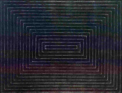
Thomlinson Park Court - Frank Stella (1959)

This piece was fairly boring to me until I started reading a bit about the artist. The absolutely amazing thing about this piece is that all of the white lines are actually thin sections of unpainted canvas. The black is house paint applied with a fairly large brush. The concentric rectangles make me feel like I'm either looking down a hallway or have an Aeriel view of an Aztec step pyramid. The focal point is obviously the center, the eye pulled to the center of the canvas. Still, more geeking out about the method rather than the result.

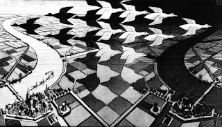
This is another piece by M.C. Escher called "Day Night." I have a book of his works at home, and I've always been fascinated by his precision and fell for morphing patterns. You can see how the black geese flying to the left materialize from the night and the white geese flying to the right side materialize form the day. And when your eye moves downward, they become part of the square of land. Both the left and right sides of this picture are mirror images...only the lighting is different.

Radial Symmetry Pattern


Photography art by Brian Auer, information is on the webpage here:
http://www.fineartphotoblog.com/nature/radially


The symmetry is clear and since the focal point of the photo is the lower right area, it is not perfectly balanced. It is a bit asymmetrical for that reason. the eye is drawn downward right and at the same time is drawn outward from the center of this plant.

Sunday, February 14, 2010

Andy Warhol was one of the
20 th century most creative and influential artists. He is most famous for his multiple images of Campbell's Soup Can, dollar bills, celebrities or Coke bottles. He chose his images because of their simplicity and familiarity. I'm not sure why I chose this particular print. I like shoes and browsing the Internet this caught my eye.

"double T pattern"

http://www.metmuseum.org/Works_of_Art/collection_database/american_decorative_arts/double_t_pattern_e_l/objectview.aspx?OID=10019733&collID=1&dd1=1 double t pattern|e l|1924|2003.312

this pattern looked really cool to me. It is a quilt that was made by somebody called E.L. The quilt is called "Double T Pattern". The blue line that borders the quilt is not actually supposed to be there, that happened when i copied the image from the website. I liked the quilt design because no matter which way you pick it up, there is something different to look at. The first thing that stood out to me was the black diamonds that are formed by the white diamonds that have the "double t" inside. An argument that can be made from this quilt is whether the white diamonds have fusion, creating the black diamonds, or vice versa. I like how the quilt is only black and white, and doesn't have any other colors. I think that if there were any other colors, the attention would shift, and not be on the double t's as the title suggests.

Friday, February 12, 2010

Pattern

This piece "Swans" by M.C. Escher is a great example of pattern. He uses different colors in order to make the shapes look different and as if they are going into a symbol resembling the infinity sign. All of these shapes, are in fact the same, and are considered by him to be swans. When in different colors though, they almost appear to be different shapes. This is a great piece by an even greater artist and in my opinion, represents pattern very well.

James Siena and Pattern


James Siena
Distorted Overlapping Grids
2004-2005
Enamel on aluminium


James Siena
Coffered Divided Sagging Grid
2005
Enamel on aluminium


James Siena
Boustrophedonic Recursive Combs
2004
Enamel on aluminium


Siena is a contemporary painter whose work is He is also very influenced by painter/sculptor Sol LeWitt (remember him from the first post on this blog? his work was posted again later on the blog). LeWitt's work is characterized as being coldly intellectual. He was known for writing out recipe cards for his work, then employing other artists to visually express his ideas from the written instructions. Siena by contrast is more romantic in his ideas about painting, rendering everything himself by hand. Like LeWitt, he also relies on 'recipes' for his work. He limits himself to geometries, and practices 'all-over painting'. This was a term invented by Jackson Pollock to describe the technique of completely covering a canvas and creating compositional equality by not favoring any part of the image over any other part. All-over painting was revolutionary in western art, which typically revolves around visual hierarchies such as clear focal points.

What's Due Tuesday, Feb 16th?

Hello all,

Just wanted to put in writing what's due Tuesday.

-Three examples of the rule of thirds, printed out with the lines drawn over the picture. The examples need not be artwork, but they must be found (by this I mean that you shouldn't draw an example of the rule of thirds)
-Your artist of the week should be posted by the beginning of class Tuesday
-The mock-up of your final composition for project #1
-The basic lines for your design laid out on your 18" x 24" piece of paper (remember to incorporate a 1" border around the edge, and to tape off the border before you start. be sure to use tape that won't tear the paper. white artist's tape should work well for this, as should blue painter's tape-- but check on a spare sheet of paper to be sure that it won't tear)

Let me know if you have any questions!

Thursday, February 11, 2010

Paul Klee


I used a paul klee pattern painting. I couldnt find anything specific on this one, no matter how hard i tried. Im assuming it might not have been his most famous work, but i love it. It really jumped of the screen when i saw it. When i doodle (which i do often) i usually doddle in symmetrical shapes like blocks. I have seen many artists do this before, but the way Klee uses the apperance of light, he brings the effect of those specific blocks jumping of the canvas, or almost being raised above the rest. I aslo have noticed with using light he also seems to make the rest of the painting appear heavier, and it almost seems to seperate the two sides.

Wednesday, February 10, 2010

Radial Symmetry


Hello All!
Thanks for all your posts. There are some very interesting examples up on the blog. A few suggestions for future blog posts:

-Try and pull images that are identifiable (artist and date) so that everyone can use the opportunity to learn more about that artist.

- When you identify formal aspects of a work, make sure you define WHERE in the image those things are taking place. (For example, if there is fusion and continuity,where is it located? What elements are fusing?)

- When you use vocabulary words, be conscious of what they mean; brush up on the vocab by going over the powerpoint presentations about line and composition that I posted on black board to ensure that you have a good grasp of all the terms we have gone over in class.
-----------------------------------------------------------------------------------------------

Below, I've included an example both of bi-lateral and radial symmetry. You can see that the canvas is divided in half, and that those two halves are symmetrical. Also, within those two halves there is concentric radial symmetry-- there is a clear focal point at the center of each set of squares. I pulled a definition of radial symmetry from the dictionary, which describes it as "the condition of having similar parts regularly arranged around a central axis". A good way to identify radial symmetry is to look for a centrally located focal point.


Frank Stella, Double Gray Scramble, 1973

Screenprint, composition: 23 3/8 x 43 1/8"; sheet: 29 x 50 3/4"

Tuesday, February 9, 2010

circle pattern

I chose this picture because it caught my eyes. I dont know who drew this but think the artist used compass to draw circles. I think the artist used fusion, continuity to complete this piece. I also think the artist used closure and radial symmetry.

Alex Grey


http://www.cosm.org/
http://www.alexgrey.com/

Okay, so, having been an adamant TooL fan since 2000, I've always wondered where their concepts emerge. The album art is always unique. When I bought the Lateralus album, I was blown away by the insert - it's a clear plastic flip book and each page is a layer in the human anatomy art by Alex Grey. He does use pattern in his art as well which makes it relevant to this subject. Anyway, Alex Grey also works with Tool on their music videos, which if you have seen you know are completely unusual and mostly consist of claymation and disturbing imagery.

As for how this art makes me feel, it makes me feel that there is more to the world than meets the eye, and that our human body and soul are somehow interconnected to the universe and its energy which gives a sense of belonging and meaning. The eyes with wings (seraphim, apparently) remind me of the seraph mentioned in a book by Madeleine L'Engle that I read as a kid [forget the name but it might be A Wrinkle In Time] in the description. It makes me think that this is some sort of god-like projection and it is hovering over the human being who is placed in the center but is much smaller in size -- the asymmetry is inherent in here and makes one feel that we [humans] are small in comparison to the higher being, but not worthless.

Quilt or Decorative Throw by Caroline Brooks Gould


I found this piece on the MoMa website. I really like the variation of color between the different hexagons. The black and red one towards the center creates a focal point, and from there the image collapse inwards onto itself. The light colors on the outside of the picture, to me, convey space.

Monday, February 8, 2010

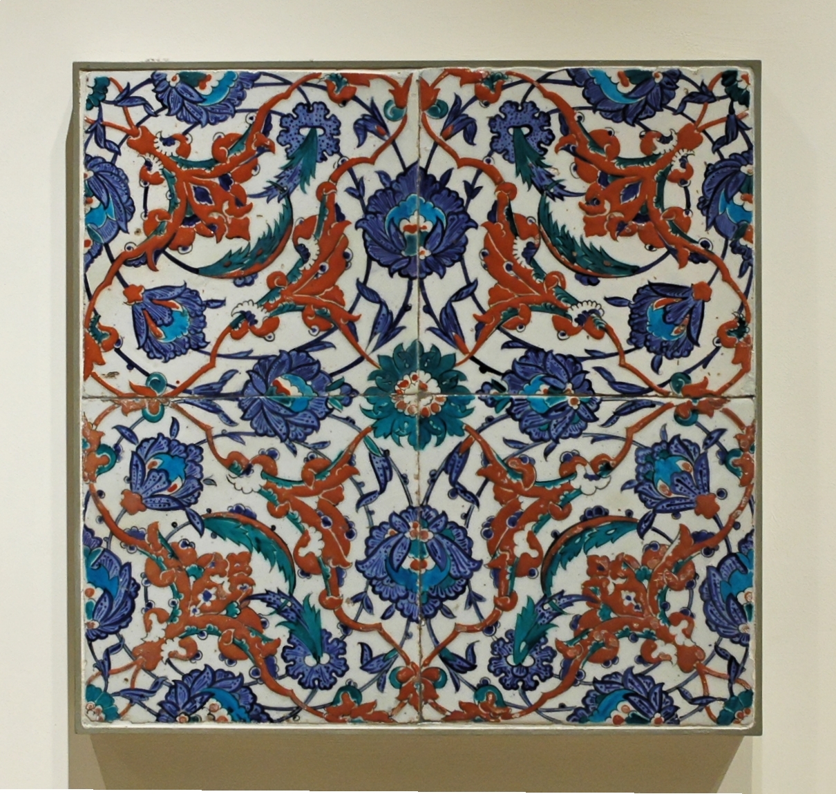
Turkish Flower Tiles


Paint on tile
Artist unknown

I choose this piece because I got a chance to visit a family friend's studio where he refurbished, collected and remade tiles from all over the world over winter break. When I visited I was fascinated by the amount of effort and detail that went into each tile. What I love about this sort of work is the amount of expression attained with such a small palate of colors (4 in this case), the swooping patterns made up of dynamic lines and thick fills. The whole pattern is a messed coil of a spring, practically popping off of the ceramic plate.

This was made by Bruno 9li an artist from Brazil. I never heard of him until now but i really like alot of his art work this one is just one of the many that grab my attencion. In this one you could see that he made it kinda like a monkey with just patterns and another thing that i like was that he only use 3 colors but it seems like a very bright and colorful picture to me. hope you guys like it as much as i did
Photobucket

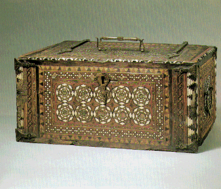
I chose this piece because it had alot of different separate patterns in it. There are many different borders running around the desk and each of them have a unique design. I also thought it wasn't your typical example of pattern. According to the site i got this off of, this was a desk used by Islamic people living in Spain. I am not sure who the artist of this piece is seeing how it is old, but it is currently being held in the Met.

http://images.google.com/imgres?imgurl=http://friendsofthehighline.files.wordpress.com/2008/04/resize-of-spencer-finch-images_page_1_cropped.jpg&imgrefurl=http://blog.thehighline.org/2008/04/28/tuesday-may-6-artist-talk-with-spencer-finch/&usg=__2-lwdOIwySgj0djHvY8vlRV6wxE=&h=957&w=1034&sz=134&hl=en&start=1&um=1&itbs=1&tbnid=JmD-s3Emjxgn7M:&tbnh=139&tbnw=150&prev=/images%3Fq%3DSpencer%2BFinch%26ndsp%3D18%26hl%3Den%26sa%3DG%26um%3D1
This work is done by Spencer Finch and located in the Chelsea Market Space. The title is “The River the Flows Both Ways”. It has very plain shape both horizontal and vertical lines. Its shape and color give me some gloomy, calm feeling at the same time. It makes me to see it again and again. Two strong and thick lines between colors are also interesting. They work as pattern and hold whole works movement which is created by the colors.

Nazare Feliciano

This is a piece of work that was done by my aunt, a professor at Palm Beach Community College. She has art galleries in Florida and also in Portugal. This was a piece that described the death of my grandmother and the small print on all of those blocks describe the relationship between them. The piece was created with a lot of ceramic blocks, pins, and took over a year to make and is very heavy. Unfortunately the wording doesnt translate very well as it was written in portuguese. She is an artist that specializes in ceramics but she does have a few paintings of her own as well. There is two or three pieces like this and you may be able to see more of them if you type in Nazare Feliciano into google.

Quilt, Eagle Pattern


this is a quilt with an eagle pattern. I found it on the Metropolitan museum of Art website http://www.metmuseum.org/works_of_art/collection_database/american_decorative_arts/quilt_eagle_pattern/objectview.aspx?page=61&sort=0&sortdir=asc&keyword=&fp=1&dd1=1&dd2=0&vw=1&collID=1&OID=10014424&vT=1

what drew me to this piece was the eagle in the middle with all the various border patterns that surround it. this piece is also symmetrical, which i found to be very cool. there are some elements of line including implied line, in-between the blue zigzag and the beige colored triangles that are more in the center. in-between these two is a blank space, but i feel as if the mind is forcing me to see another set of pattern there, even though there technically isn't.

Sunday, February 7, 2010

VALERIE JAUDON,Toomsuba


1973, acrylic paint on canvas by Valerie Jaudon.
You can find this contemporary painting in Hudson River museum in Yonkers, NY. It is a part of pattern and decorative movement exhibition.
The pattern creates an image of woven basketry as the artist explains. Her later works are influenced by Islamic screens and tiles.
Looking at this painting I see the pattern creating circles starting in the middle and by moving outward increasing in size.

Thursday, February 4, 2010

Seamless Victorian Rose Pattern

I love the delicate simplicity in this Victorian Rose pattern. It seems difficult to duplicate such a pattern, turning the roses around at a precise angle and making sure they all fit in a way that doesn't make it looked too "stuffed" or too empty in a single area. I also like the focus in the center, the faded swirl and the lighting upon this piece that gives it its antique feeling.

Wednesday, February 3, 2010

Pattern Assignment


Hello all! Here are a couple of examples of appropriate pattern samples for Friday's class. (Yours should be 3" x 3" each and be taped to a single sheet of paper so that we can see them all at once) Let me know if you have questions.


White Lines by I. Rice Pereira


http://www.metmuseum.org/works_of_art/collection_database/modern_art/white_lines_i_rice_pereira/objectview_enlarge.aspx?page=18&sort=0&sortdir=asc&keyword=&fp=1&dd1=21&dd2=0&vw=1&collID=21&OID=210008364&vT=1


This piece is called "White Lines" by I. Rice Pereira. I found it on the website for the Metropolitan Museum of Art.

In the center there is a black background that has several white lines including horizontal lines, vertical lines, diagonal lines, and many of the lines intersect at one point or another. Surrounding the white lines in the center is what could be described as an upside down U. This "U", is created through three rectangles which are shaded in with more lines inside.

I think my eye was first attracted to the stack of horizontal lines in the center. It almost looks like a stack of plywood at a hardware store. This stack repeats a couple more tim3es throughout the piece. All the white lines in the center at first may seem like they are going in random directions, but once you take a closer look, you can see that they begin to form different shapes. For example the lines in the bottom right corner. There is a diagonal line going towards the top left, and it has a semi-circle connected to it which is then shaded in. This looks like a golf club to me.

Monday, February 1, 2010

Line Art


Study for Wartime Evacuation
Dean Cornwell
Pencil and conté crayon on paper.


I was initially drawn to this piece by its incompleteness. I love pieces that look like they're half way though production because it allows one to see the process and effort that an artist undertakes and exerts in making a piece, respectively.

The bold use of organic lines in this piece really make the faces come alive, to become almost caricaturesque figures.

Composition - Willi Baumeister 1948


The obvious place to start is with this piece is the fairly overt human form on the left. One armed and disjointed as it is, these indistinct shapes do imply human form. The lines consist mainly of contours that vary in weight only slightly along certain edges of the shapes. Very light lines intersect with the more bold shapes in what I'll refer to as the foreground. What it makes me think of is as if a 2d slice of a 3d person was put on display and another was taken as they started into motion.
The lines, with their abstract shapes and varying widths, are fairly organic. Likewise, the shapes imply motion or passage of time if one were to see the lighter lines as a snapshot of where this strange creature had been moments ago.
The varying shapes on the left confuse me somewhat, almost interjecting a more static element to a piece that evokes movement and change. The texture seems to jump out of the page and is somewhat jarring.

"Houses among Trees" by Vincent Van Gogh

This piece is entiled "House among Trees" which is drawn by Vincent Van Gogh in July 1890. It is currently located at Van Gogh Museum. I chose this picture because it looked like the artist was having hard time while he was drawing this piece. He seemed to use black charcoal and India ink to make these fuzzy and straight lines. He also seem to use different thickness of the line. Even though I felt depressed when I first look at this picture, I liked how he drew by using only one color.
This piece was done by Alexander Calder and was held in the MoMA from 2007-2008. I, personally, am really moved by this sculpture. The line here is used in such a way that portrays emotion very well and intentionally. The expression in the face is something that everyone can understand and the openness of the body towards the audience allows us to see everything very clearly. I believe that this piece was done all with one piece of wire, which is just amazing and must have taken much hard work. This sculpture is just all around intriguing and artistic and exemplifies line in such a great way.

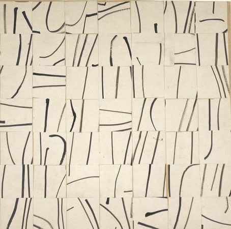
“brushstrokes cut into 49 squares and arranged randomly”

Photobucket

The piece is entitled “brushstrokes cut into 49 squares and arranged randomly”, and is by Ellsworth Kelly. I guess i chose this piece because it looked like the artist had fun with it. He used what appears to be India ink (?) to make all these 'stray' lines and then chopped up his canvas into small pieces so he could rearrange them. I think there is a kind of carefree enjoyment you get from looking at this piece- the way the lines don't share even widths, how the brushstrokes aren't neat and the different directions the strokes curve in - all amplified by how the 49 square have been re-arranged.

Sunday, January 31, 2010

Lady Gaga's Dress; Johan Hagemeyer

http://www.popsugar.com/Photos-Lady-Gaga-Grammys-7234651?page=0,0,0

I know it's not traditionally considered art, but fashion is now in museums on display as art. Lady Gaga is basically a walking work of art. The artist of the dress is actually the couture designer, Giorgio Armani.

When I saw her dress the first thing I noticed was the use of line, which includes not only the obvious 'hoops' on her dress but also her star. This is 3d art, much like a sculpture, and designed to go on the human body.

The lines in her dress are gestural, and interconnected as they go from the top of her body and down, and draw your eye both ways. The color is light and frivolous, the lines are energetic and unbalanced - they are mostly horizontal. on the star, they are both horizontal and vertical, and are very stable and straight as well as symmetrical whereas the dress is asymmetrical. The dress gives a feeling of being weightless and yet structured.

---

In more traditional art, this piece is photography line art:

http://www.metmuseum.org/works_of_art/collection_database/photographs/utility_lines_johan_hagemeyer/objectview_enlarge.aspx?page=522&sort=0&sortdir=asc&keyword=&fp=1&dd1=19&dd2=0&vw=1&collID=19&OID=190017384&vT=1

Photobucket

In this print, the feeling is of rigid confinement and structure, which defines the industrial revolution. The utility pole is coming inward and your eye is drawn from the bottom to the top, then to the left with the thinner lines. They are contoured lines and some cross-hatching occurs with the other pole's lines intersecting, to create diamond and triangular shapes - a lot of geometric shapes are in this piece. The utility pole looms over the building (?) which is stifled and almost shrinking to the pole. The message or feeling is that this sort of technology is strong, and is gaining power or on the rise. In the description it says it is telephone wires. The advent of the telephone increased the ability for communication across large distances. These wires span the horizon and stretch beyond the frame of the print to give an illusion of continuity.

[I wasn't sure if the dress was considered art so I placed both items in this post].

Modular Structure by Sol LeWitt


I like this because of the intricacies of the cross-hatching lines. How the lines are more concentrated in the center giving it depth, and less concentrated on the outside, bringing the eyes to the center, and how they change depending upon the angle you're looking at it from. Some of the lines blend together more than others, and if you relax your eyes the picture begins to look two-dimensional, giving the design of the cross hatches a different character.

Whale


from Moma homepage,(moma.org/visit/calendar/exhibitions/323)Gabriel Orozco. Mobile Matrix. Graphite on gray whale skeleton. 196 x 1089 x 266 cm. I think this 3D art can be the lines. Its each born and whole shape and making some lines and have their own gesture, contour, and even some hatch. Also bones have lines on them and these make the whole thing more beautiful.

It is really great because when we see or take picture in different angles, distances, and brightness, we can find different effects of lines. It is very active, natural and delicate. It has much kind of lines, diagonal, horizontal and vertical.


Onement III by Barnett Newman


I selected this painting for the simplicity of it. It consists of one line. painted with oil on canvas, and it is painted roughly. not a consistent line, but broken. I have the feeling that a painting like this is seen two different ways. One, as an effortless piece that anyone could compose, and i guess in a sense that could be correct. Or two, a simple painting, that is trying to say much more with projecting much less. perhaps this is a glimpse in to the mind of a man trying to speak a feeling, could be loneliness. Or that is just the feeling i seem to see or experience when i look at it.

Jay DeFeo Persephone

I found this work by Jay DeFeo called Persephone, 1957 on MOCA site. The materials she used include oil, graphite and charcoal. Looking at this picture I imagined a strand of hair especially with the color tone DeFeo used for the bakround which reminds me a color of skin; but the delicate vertical graphite lines can also depict grass or perhaps something more imaginary as a flowing river.