when I visited the Dorsky Museum, I looked at many of the pieces in the "Body, Line, Motion" exhibit. There were several interesting pieces, but the one that caught my eye the most was the "Portrait of a Man--Diego" by Alberto Giacometti. This piece was a drawing of a human head, from the shoulders up. What caught my eye the most was all the different lines that were used in the piece. There was more attention put to the face and the head than the shoulders and the neck. You can even tell that giacometti worked on the neck a couple of tiems, making it stand out. You can see the lines and the progression.
the face is definitely the boldest part of the piece. It stands out the most, especially with all the lines that were used to create the different parts of the face. I like how the lines used to make an outline of the circles for the eyes continues down into parts of the nose. This also put more emphasis in this area which draws the viewer's eye towards this area.
Thursday, February 18, 2010
Museum
I saw Renée C. Byer’s photos. The pictures were very energetic. The pictures looked like they were sad or more like upset for some reasons. I felt little uncomfortable when I see them. Many of them were black and white. Also the subject and titles were shocking like ‘murdered parents’ and etc.
There was a picture that sick kid and his mother were hugging. It gave me uneasy and anxious feeling rather than peaceful or happiness. Its dark color, mother’s wrinkle and closed eyes were very effective. The child’s arms and position was making uncompleted hug and kind of diagonal lines. They were making it unstable. Its title is "The Sacramento Bee" by Renée Byer.
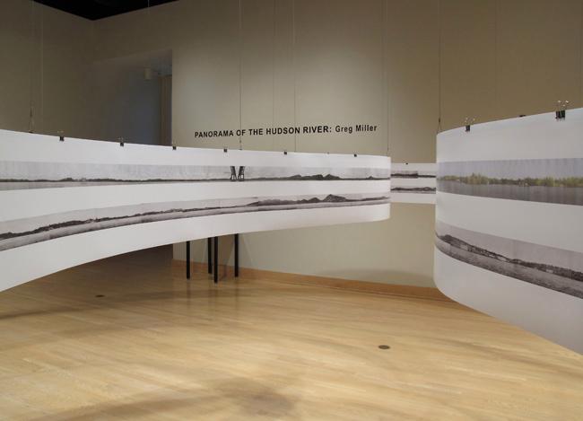
Panorama of Hudson River- Greg Miller
 Although I've heard about Dorsky museum and lots of people asked me the directions of this building, I never been to Dorsky museum before. I was excited to see the artwork of the artists.
 I went to Carolee Schneemann's section because it had many interesting artworks. I liked Caged cats 1&2 and hand/heart for Ana Mendieta but this photogragh caught my eyes. It is taken by Greg Miller in 2009. When I looked at this picture I could learn the historical differences between past and present times. I liked this piece because it shows the development of the hudson river. I know that Hudson river is really long and the artist must have spent many times taking this photographs.
Tuesday, February 16, 2010
Andy Warhol- 100 cans

I liked this pattern because it looks colorful.
He used oil paint in canvas. He created this piece in 1962.
This is an example of symmetrical composition because cans are placed in straight lines and if you divide the painting in half, you can see that each side is exactly the same.
This Week's Post
Hello All,
This week, rather than posting an image and a formal analysis on the blog, I would like you to visit the Samuel Dorsky Museum of Art here on campus. When you visit, focus on one exhibit (there are currently three going on), then pick one work of art that you respond to and write a two paragraph summary detailing
-what exhibit you saw
-how you felt about it
-what piece most caught your eye
-a brief formal description of that piece
All in all, this should take you less than one hour. At 11am after Friday's class, I will be going to the Museum and I invite you all the join me. It will be a good opportunity to respond to some artwork in the flesh rather than simply viewing images online.
As always, please contact me with any questions/concerns.
Best of luck on your drawings!
Cezanne

http://www.expo-cezanne.com/1_3.cfm?id=-1656112551
This is "Still Life with Peppermint Bottle" by Cezanne. It is painted during 1890- 94, size 65 x 81 cm, oil on canvas. It has bluish color all over and apple's bright colors hold my eyes. The white clothe is also helping its contrast. Some interesting patterns are making it lively.

Judith Visker’s “Colored Rain” struck me as an interesting pattern painting. The droplets of ‘colored rain,’ which appear to swim like a shoal of brightly colored fish in a dark ocean, each contain their own pattern, at once just similar enough to another in the group to tie them all together, and just different enough to stand out against the darkness. The colors are vivid and intense, making the piece eye-catching, and the fluid motion of the group draws your eyes along the flood of droplets, adding a dynamic that is altogether interesting.
Monday, February 15, 2010
Thomlinson Park Court - Frank Stella (1959)
 This piece was fairly boring to me until I started reading a bit about the artist. The absolutely amazing thing about this piece is that all of the white lines are actually thin sections of unpainted canvas. The black is house paint applied with a fairly large brush. The concentric rectangles make me feel like I'm either looking down a hallway or have an Aeriel view of an Aztec step pyramid. The focal point is obviously the center, the eye pulled to the center of the canvas. Still, more geeking out about the method rather than the result.

This is another piece by M.C. Escher called "Day Night." I have a book of his works at home, and I've always been fascinated by his precision and fell for morphing patterns. You can see how the black geese flying to the left materialize from the night and the white geese flying to the right side materialize form the day. And when your eye moves downward, they become part of the square of land. Both the left and right sides of this picture are mirror images...only the lighting is different.
Radial Symmetry Pattern

Photography art by Brian Auer, information is on the webpage here:
http://www.fineartphotoblog.com/nature/radially
The symmetry is clear and since the focal point of the photo is the lower right area, it is not perfectly balanced. It is a bit asymmetrical for that reason. the eye is drawn downward right and at the same time is drawn outward from the center of this plant.
Sunday, February 14, 2010
 Andy Warhol was one of the
 20 th century most creative and influential artists. He is most famous for his multiple images of Campbell's Soup Can, dollar bills, celebrities or Coke bottles. He chose his images because of their simplicity and familiarity. I'm not sure why I chose this particular print. I like shoes and browsing the Internet this caught my eye.
"double T pattern"
http://www.metmuseum.org/Works_of_Art/collection_database/american_decorative_arts/double_t_pattern_e_l/objectview.aspx?OID=10019733&collID=1&dd1=1 
this pattern looked really cool to me. It is a quilt that was made by somebody called E.L. The quilt is called "Double T Pattern". The blue line that borders the quilt is not actually supposed to be there, that happened when i copied the image from the website. I liked the quilt design because no matter which way you pick it up, there is something different to look at. The first thing that stood out to me was the black diamonds that are formed by the white diamonds that have the "double t" inside. An argument that can be made from this quilt is whether the white diamonds have fusion, creating the black diamonds, or vice versa. I like how the quilt is only black and white, and doesn't have any other colors. I think that if there were any other colors, the attention would shift, and not be on the double t's as the title suggests.
this pattern looked really cool to me. It is a quilt that was made by somebody called E.L. The quilt is called "Double T Pattern". The blue line that borders the quilt is not actually supposed to be there, that happened when i copied the image from the website. I liked the quilt design because no matter which way you pick it up, there is something different to look at. The first thing that stood out to me was the black diamonds that are formed by the white diamonds that have the "double t" inside. An argument that can be made from this quilt is whether the white diamonds have fusion, creating the black diamonds, or vice versa. I like how the quilt is only black and white, and doesn't have any other colors. I think that if there were any other colors, the attention would shift, and not be on the double t's as the title suggests.
Subscribe to:
Posts (Atom)