Congratulations! You're almost done with the semester. The blog posts are done, and now all that remains is to finish your final project. I will be grading your sketchbooks on Tuesday. Please bring them to class and you can pick them up during the final.
Your sketchbook should include all the sketches you were assigned during the semester, as well as those we did during class. I will be concentrating on sketches done since spring break. Here is a list of what I will be looking for in your sketchbook:
-Preparatory sketches for project 2
-Preparatory sketches for project 3
-Three figure drawings done outside of class
-30 minute ink drawing of shadows in the natural environment done in class
-Color wheel (in class)
-Color matching (in class)
I will not be accepting late sketchbooks so please be sure to turn them in on Tuesday at the beginning of class.
Also, I below is a breakdown of how I will be calculating your final grade:
Projects (3 total) --- 50%
Assignments (5 total) --- 20%
Sketchbook --- 10%
Blog ---- 10%
Participation --- 5%
Attendance --- 5%
This has changed slightly from the syllabus. I have made these adjustments because we have had less assignments and those assignments have been less rigorous than stated in the syllabus. I also informed everyone at the beginning of the semester that each blog post would be worth one percent of your final grade. If anyone has questions about these changes, please let me know.
Finally, here is a list of the assignments you have been given throughout the semester, which I will be grading during our one on one meetings:
1. Line
2. Pattern
3. Still Life
4. In class fabric drawing and figure drawing
5. Altered map
Thursday, May 6, 2010
Tuesday, May 4, 2010

Title: Magnolia Tree 40x40x50cm Su Blackwell
This work is very detailed. I like this because the tree pops up from the flat book surface. It doesn’t lose its harmony because its leaves and branch are made out of the book. Many words on the leaves seem that each of them have some messages. There are not many colors but most of them are black and white. I think that makes this work more thoughtful and beautiful.
Monday, May 3, 2010
Meliisa Jay Craig - That's Life


I like that her message is delivered strictly through the material and not through images or words. Craig took a book--something that is symmetrical and has a manufactured shape and turned it into something organic and growing. She turned something industrial into something natural. Craig used kozo, abaca, oak inserts, and poplar to achieve this look.
 Judith Hoffman created this book art. I love it just because it's so fun and silly and I actually laughed when I saw it. I think that that may have been the point; to strike an emotion in the viewer. She probably knew that most people would find it at least a little bit amusing.
She said "The content of my books comes from my dreams, personal mythology and stream-of-conciousness writing. I also draw inspiration from illuminated manuscripts and the components of modern books; the tables of contents, the page numbers and the chapter headings are all wonderful to me."
When looking at this piece, it is easy to see that she was keeping in mind that 'mythological' or dreamlike idea.
Their Journey Begins


I chose this piece by Lois Morrison entitled "Their Journey Begins" I believe it is the third part of a series of works done by Morrison called "The Hollow Dolls". I felt this piece was really creepy and stark. Once you get past the cover the inside is completely black and white save for the two dismembered dolls. These dolls, one only a torso, the other missing it's head, star as the main characters of this book. The story tells of their pointless wandering through the foliage. Despite the lack of traditional plot, the book was still enjoyable to read and look at.
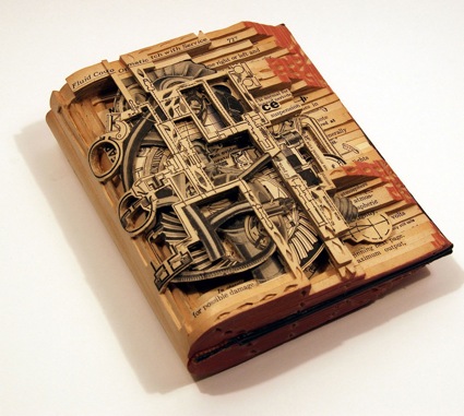
I found this image on artistaday.com. It comes from Brian Dettmer working out of Atlanta Georgia. The work is a book that has been cut into various layers in order to form a new and original piece out of something that already exists. As can be seen by the words on the heading, the various components of the piece come from completely different sectioins of the book. At first sight, I thought of how well it represented the intricacies and mysteries that can be found in literature, however I have no idea if that is what the artsist was trying to convey,
Sea-scape

This sea-scape gives has such a calming effect on the viewer. An artist named Daryl created this. I love the consistency with the use of nothing but watercolor as she portrays light hitting the rocks and the waves. The tunnel gives an almost 3-D depth to the pictures and just make me want to run in and take a swim.
Hidden
This image was found on an art web site for only tunnel art books. I couldnt find the artist, for some reason it wasnt posted. It was a series of pictures taken in Venice, Italy, during Carnevale. I like the fact, it was spooky in a way. The different way the artist folded the book is different then the way most people have done it. The whole thing is done in photographs, and there is a poem written inside and on the outside. The artist only used these models whos faces are painted and are not allowed to talk during the festival, which i think in someway contributes to the depth of the book. Beauty, that can only be looked at, and in order for it to actually "talk" to you, you have to really hear whats its trying to say.

Eight Slices of Pie

This piece is called “Eight Slices of Pie” and is created by Emily Martin. I liked how she put her artwork into the pie case because it looked like a real pie. It made me hungry when i saw this work. Each of eight piece has words on it and when you open each of them, you could read what she wrote inside. I think she printed her words by computer but she may used color pencils when she drew the pie.
Scott McCarney

http://www.popularkinetics.com/scottmccarney_page.html
This piece is called "Alphabet 1" and is by Scott McCarney. I liked how McCarney made the letters pop out out the viewer. With the way the light is shining the shadows of each letter wind up on the next letter which makes it look cool. I am curious as to why McCarney chose the letters A-G as opposed to any other letters. Plus these letters were all in order. He could have chosen any random letters.
Subscribe to:
Posts (Atom)