Congratulations! You're almost done with the semester. The blog posts are done, and now all that remains is to finish your final project. I will be grading your sketchbooks on Tuesday. Please bring them to class and you can pick them up during the final.
Your sketchbook should include all the sketches you were assigned during the semester, as well as those we did during class. I will be concentrating on sketches done since spring break. Here is a list of what I will be looking for in your sketchbook:
-Preparatory sketches for project 2
-Preparatory sketches for project 3
-Three figure drawings done outside of class
-30 minute ink drawing of shadows in the natural environment done in class
-Color wheel (in class)
-Color matching (in class)
I will not be accepting late sketchbooks so please be sure to turn them in on Tuesday at the beginning of class.
Also, I below is a breakdown of how I will be calculating your final grade:
Projects (3 total) --- 50%
Assignments (5 total) --- 20%
Sketchbook --- 10%
Blog ---- 10%
Participation --- 5%
Attendance --- 5%
This has changed slightly from the syllabus. I have made these adjustments because we have had less assignments and those assignments have been less rigorous than stated in the syllabus. I also informed everyone at the beginning of the semester that each blog post would be worth one percent of your final grade. If anyone has questions about these changes, please let me know.
Finally, here is a list of the assignments you have been given throughout the semester, which I will be grading during our one on one meetings:
1. Line
2. Pattern
3. Still Life
4. In class fabric drawing and figure drawing
5. Altered map
Thursday, May 6, 2010
Tuesday, May 4, 2010

Title: Magnolia Tree 40x40x50cm Su Blackwell
This work is very detailed. I like this because the tree pops up from the flat book surface. It doesn’t lose its harmony because its leaves and branch are made out of the book. Many words on the leaves seem that each of them have some messages. There are not many colors but most of them are black and white. I think that makes this work more thoughtful and beautiful.
Monday, May 3, 2010
Meliisa Jay Craig - That's Life


I like that her message is delivered strictly through the material and not through images or words. Craig took a book--something that is symmetrical and has a manufactured shape and turned it into something organic and growing. She turned something industrial into something natural. Craig used kozo, abaca, oak inserts, and poplar to achieve this look.
 Judith Hoffman created this book art. I love it just because it's so fun and silly and I actually laughed when I saw it. I think that that may have been the point; to strike an emotion in the viewer. She probably knew that most people would find it at least a little bit amusing.
She said "The content of my books comes from my dreams, personal mythology and stream-of-conciousness writing. I also draw inspiration from illuminated manuscripts and the components of modern books; the tables of contents, the page numbers and the chapter headings are all wonderful to me."
When looking at this piece, it is easy to see that she was keeping in mind that 'mythological' or dreamlike idea.
Their Journey Begins


I chose this piece by Lois Morrison entitled "Their Journey Begins" I believe it is the third part of a series of works done by Morrison called "The Hollow Dolls". I felt this piece was really creepy and stark. Once you get past the cover the inside is completely black and white save for the two dismembered dolls. These dolls, one only a torso, the other missing it's head, star as the main characters of this book. The story tells of their pointless wandering through the foliage. Despite the lack of traditional plot, the book was still enjoyable to read and look at.
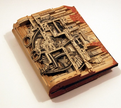
I found this image on artistaday.com. It comes from Brian Dettmer working out of Atlanta Georgia. The work is a book that has been cut into various layers in order to form a new and original piece out of something that already exists. As can be seen by the words on the heading, the various components of the piece come from completely different sectioins of the book. At first sight, I thought of how well it represented the intricacies and mysteries that can be found in literature, however I have no idea if that is what the artsist was trying to convey,
Sea-scape

This sea-scape gives has such a calming effect on the viewer. An artist named Daryl created this. I love the consistency with the use of nothing but watercolor as she portrays light hitting the rocks and the waves. The tunnel gives an almost 3-D depth to the pictures and just make me want to run in and take a swim.
Hidden
This image was found on an art web site for only tunnel art books. I couldnt find the artist, for some reason it wasnt posted. It was a series of pictures taken in Venice, Italy, during Carnevale. I like the fact, it was spooky in a way. The different way the artist folded the book is different then the way most people have done it. The whole thing is done in photographs, and there is a poem written inside and on the outside. The artist only used these models whos faces are painted and are not allowed to talk during the festival, which i think in someway contributes to the depth of the book. Beauty, that can only be looked at, and in order for it to actually "talk" to you, you have to really hear whats its trying to say.

Eight Slices of Pie

This piece is called “Eight Slices of Pie” and is created by Emily Martin. I liked how she put her artwork into the pie case because it looked like a real pie. It made me hungry when i saw this work. Each of eight piece has words on it and when you open each of them, you could read what she wrote inside. I think she printed her words by computer but she may used color pencils when she drew the pie.
Scott McCarney

http://www.popularkinetics.com/scottmccarney_page.html
This piece is called "Alphabet 1" and is by Scott McCarney. I liked how McCarney made the letters pop out out the viewer. With the way the light is shining the shadows of each letter wind up on the next letter which makes it look cool. I am curious as to why McCarney chose the letters A-G as opposed to any other letters. Plus these letters were all in order. He could have chosen any random letters.
Saturday, May 1, 2010
 Carol Barton, Tunnel Map 1988
This tunnel book is a little unusual because of its circular shape depicting the shape of our Earth. The book art is known already from 1800 hundreds when the books were popular as toys for children. What I like about the book art is that you don't necessary need to have drawing or painting talent. Book art is more about mechanical skills. Instead of pencil drawing you can use other technique like cutting and putting pieces together to form a book. With many cut outs and special tools available in craft store it can be easier than ever. To me its very similar to card making or scrapbooking.
Tunnel Art
I know this will be repetitive of me since I talked of him once before, but this 'Chapel of Sacred Mirrors' which I believe is located in NYC is a form of 'tunnel' art because you are experiencing it when you are in this place.
Here is a traditional tunnel book artist... (click it to see it full size)

Ann Stinner, titled "Drift" about life in the prairie. The materials she used are painted papers, stencil, collage, paste paper, and machine-perforated treatments; acrylic paint, gesso, and wheat paste were used in the colouring of the papers; laser printed written texts. I think her own statement about her work says it best.
Artist's Statement: What impresses me most about life on the prairies is the powerful influence of the natural elements. In spite of differences in ethnic background or daily routines, all of us who live here must adapt to the climate and the weather. Nature is a great equalizer, and a key determinant of prairie culture. These ideas interest me as an artist. In the midst of the beauty and vastness of the landscape, and in the face of wind, snow, and floods, our human presence often seems vulnerable and temporary. Even if we live in cities, we all pay attention to the rhythms of the seasons and try to anticipate the natural events which occasionally surprise us. This book work suggests, through both visual and verbal means, some aspects of the uneasy yet respectful relationship human beings have with their prairie environment.
Here is a traditional tunnel book artist... (click it to see it full size)
Ann Stinner, titled "Drift" about life in the prairie. The materials she used are painted papers, stencil, collage, paste paper, and machine-perforated treatments; acrylic paint, gesso, and wheat paste were used in the colouring of the papers; laser printed written texts. I think her own statement about her work says it best.
Artist's Statement: What impresses me most about life on the prairies is the powerful influence of the natural elements. In spite of differences in ethnic background or daily routines, all of us who live here must adapt to the climate and the weather. Nature is a great equalizer, and a key determinant of prairie culture. These ideas interest me as an artist. In the midst of the beauty and vastness of the landscape, and in the face of wind, snow, and floods, our human presence often seems vulnerable and temporary. Even if we live in cities, we all pay attention to the rhythms of the seasons and try to anticipate the natural events which occasionally surprise us. This book work suggests, through both visual and verbal means, some aspects of the uneasy yet respectful relationship human beings have with their prairie environment.
More Book Artists
Remember, you have a post due Tuesday on book arts. If you're stumped, try looking at some of the artists I've posted in the last few days. Here are a few more book artists / artists that use the book format to look at:
-Keith Smith
-Art Spiegelman
-John Baldessari
-Columbia College Center for Book and Paper Arts
-Tom Phillips, The Humument
-Ron King, Turn Over Darling
-Scott McCarney, In Case of Emergency
-Martine Aballea, Triangle
-Conrad Gleber, Meat Book
-Allison Cooke Brown
-Emily Martin, Eight Slices of Pie
-Johanna Drucker
-Pamela Spitzmueller
-Maddy Rosenberg, Shadow of Descent
-Lois Morrison
-Sandra Jackman, On a Darkling Plain
-Mary Bennett, German Egypt
-Jan Owen
-Meret Oppenheim
-Audrey Niffenegger
The above links don't all contain images, but are rather a place to start in searching for books by these artists.
Also, there is a wonderful, fcomic book called "The Pop-Up Book of Phobias" by Gary Greenberg. I've included some images below. This is a wonderful example of what I have been talking to many of you about-- namely the importance of playing with perspective (how is your viewer entering the scene? are they in the middle of the action or on the sidelines?). Pay special attention to the way the viewer is implicated in the scenes below; the viewer is in the dentist 's chair, looking down at a dirty toilet, looking up from the bottom of a grave, standing on the ledge of a tall building. Because of this shift in point of view, the viewer is drawn into the scene and experiences it more viscerally.


Friday, April 30, 2010
Artist Books

http://www.donnaseagergallery.com/art_of_the_book/artists/Howard_Munson/images/Valle%20del%20Mais%20400.jpg
This is one of the many artist books that really liked. This book is by Howard Munson, and the reason I like it is, because he doesn't focus on only figures, he focuses on many different things. Munson is well known for his pop ups, and the "naked" prints and drawings, enclosed within these crafted casings make the book arts the best medium for Munson's talents.
Kara Walker
The artist I really liked was Kara walker. I love the fact that she can make anything she wants out of a piece of paper. I also like her ideas. When her exhibitions are displayed the illusions are strong and visible. Her focus on black cut outs also make me wonder, why the option of black? Her work is pretty amazing.
figure drawing- julie

http://www.jenniferklemp.com/show-image/69606/Jennifer-Klemp/figure-drawing--julie.jpg
The reason I picked this drawing is, because I like how the basics are layed out on the paper. I also like how the artist worked around the basics and created the basic drawing of Julie's body. Even though this drawing is not specifically detailed, it looks really professional.
Ribbons of Color

http://fineartamerica.com/images-medium/ribbons-of-color-brenda-adams.jpg
This abstract colored drawing by Brenda Adams is one of my favorites for two reasons. One is an abstract drawing, and two the blending of colors is awesome. The movement of the color makes a statement and I personally believe that any art piece has to make a statement in order to be strong. I also like the fact that she doesn't try to match the colors together, but tries to organize them so that either way they would interact with each other.
Thursday, April 29, 2010
As You Work, Consider the Following Artists
Hello all,
We talked about Andrea Dezso's work in class, but I never gave you her website. Click here to see more of her work.

Andrea Dezso, Living Inside, 2009, tunnel book series

Andrea Dezso, Living Inside, 2009, tunnel book series
Also, as I was researching papercutting online, I found Peter Callesen, also working in paper. Click here to see more of his work.


Peter Callesen, Snowballs, 2005

Peter Callesen, In the Short Distance Between Time and Shadow (detail), 2006
Tuesday, April 27, 2010
Video

I like Kiki Smith’s works. I think her works are very delicate and pretty in a way. As she said that the art is “movement from inside to physical world” and “a way to think”, I can see her thoughts. Her arts seem expressing vain and death. Works were beautiful but those were definitely different from Kara Walker’s which have strong claims. I mean, Kara Walker have more energetic feeling to the world, may be anger? Those differences are on the arts. I kind of like the fact that Kiki Smith’s ‘deaths’ were not ‘fear’ but more beautiful in a way.
-Han
-Han

I thought the work done by artist Kara Walker was both creepy and delightful. I liked how she made her cut-outs powerful using just silhouettes and and lighting. I especially liked the exhibit where she used the lighting to, quite literally, bring the audience into the work. The subject of her work is usually slavery and is very moving. The images, while not detailed, are extremely violent sometimes. It was surprising to find that such a powerful artist wasn't well-known. I couldn't find a lot of the pieces from the video in any sort of decent size online.
Monday, April 26, 2010
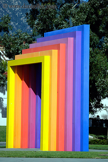
I saw this image as it caught my eye when searching through google. I believe that this can also be included as tunnel art as it is located right in Santa Barbara California. The vast differentiation of colors make the tunnel very appealing to look at. As well every time a person looks through that tunnel there is a different story being told. So basically the artist leaves it to the eye of person looking through it.


I really enjoyed kara walkers work. The cutting out of the potraits of actual people had a lot of meaning to it. Not only was it art but the art had a distinct meaning to it. She was telling a story through her art which made it that much more interesting. There were several examples of the civil war south with slavery and it didnt give colors to people everything was in just black and white. I just found her work very detailed but at the same time very simple. The peoples edges were cut in great detail but the overall person does not contain eyes and the shading you would see in a normal person, therefore making everyone look the same.
I particularly enjoyed watching Kara Walker's artistic process. The provocative nature of her work really woke me up that morning. At first glance i saw these silhouettes and thought nothing of it until I realized one of the ladies was eating someones head. Listening to her explanation of the other-worldly south and how it inspired a lot of her work was pretty captivating and insightful. I also thought casting the audience's shadows on the pieces on display was a great way to really get the viewers to think about the content.
I liked both Do -Ho Suh and Kiki Smith in the video. The first had a little different approach and used a lot of sewing in order to bring his parents house to life. He had to have a very strong feelings towards the house since he wanted to carry it with him where ever he had to move. I think it is pretty cool to be able to carry a replica of the house in a suitcase and feel a little less homesick in any new country.
About Kiki Smith I felt like whatever crazy idea she got she transferred it into an interesting piece of art. She could work with any material or use any technique, and the final product would be amazing. Also I have to give credit to her large amount of people working in her atelier.
About Kiki Smith I felt like whatever crazy idea she got she transferred it into an interesting piece of art. She could work with any material or use any technique, and the final product would be amazing. Also I have to give credit to her large amount of people working in her atelier.
Kara Walker was such an interesting artist to look at. She had such solid intent with each thing that she did, which is not true for many artists. She would think of a scene or figure in her head and bring it perfectly to life. That is something that is extremely difficult to do and she must get frustrated easily. The way that she cut those pieces of paper perfectly just kept me in awe, especially after cutting out pieces of the map after watching the movie. It takes such patience and skill and I really give her credit for that.
 Rene Magritte was known for his surrealist paintings. This piece, "Black Magic" is a great example of a great piece of his and also of figure drawing. I will never be able to express the amount of appreciation I have for this and most of the rest of his work. The body is practically perfect and looks almost like a picture; everything is proportional and looks so real and beautiful. The shadows are all in the right places and the woman looks real.
Hanging Woman
 I admire all the artists for their need for self-identity that differs largely from anyone else. They all had their reasons for their artwork, whether it was to feel more at home, tell history thru art, or just to express yourself and whatever may be tugging at the corners of your mind. Kiki Smith's work had a lot to do with still, quiet death images. Most of her work may seem rather disturbing, but whose work isn't? Looking into someone's mind and heart takes guts and to lay yourself bare for all teh world to see is even more courageous. This may be a portrait of death, but it could also be telling something about herself. Maybe she is trying to draw a connection between herself and the unaccepted Wiccans during that Salem Witch Trials, maybe she's trying to show her shyness thru the hair that's covering the woman's head, the position of the feet, the light and slightly dark colors. All in all, I find what she does beautiful.
Sunday, April 25, 2010
 i really loved both, kiki smith, and kara walker. Both seemed to have this confidence about there work, and know why they do it. The meaning behind both artists work is very interesting. Kara has this internal and external struggle that she portrays with these cutouts, and to have such a "simple" medium convey such an enormous response is to me the main reason for being an artist. Kiki Smith on the other hand is great, one, because she says that it doesnt just take talent to become what she has become but hard work, from her self, and the many people she has on staff with her. She really concentraits on the feministic view of the world and old world myths and takes her art into that realm of untouchable, but really speaking to us directly. i loved both of them.


Review of Art 21

When I was watching this video, it gave me lots of inspirations of what we are going to do for the next project. There were four artists in this video and each artists had their own style and characteristics but Kiki Smith gave me deep impression. Unlike other artists, she seemed to have passion about dead animals such as birds and cats. She also used herself by putting gypsum on top of her. This showed that she showed hard work on her work.Also, she had passion of her artwork because most artists do not deal with death/dead but Kiki Smith was dealing with it.
art 21 response

Even though we only watched a couple of minutes of Do-Ho-Suh's section in the show, "Art 21" i still liked his ideas of recreating his home, down to the dimension, in a totally different place. I thought it was very creative and original, as well as a very smart way to avoid becoming homesick. some people put up pictures or posters or arrange their furniture a certain way while Suh tries to copy every exact detail that he can as best he could. i liked the idea he had with the fabric, i thought it was a neat touch.
i thought that this piece of suh's works best represented what we watched during class. this piece is called "Fallen Star" http://exhibitioninquisition.files.wordpress.com/2009/09/do-ho-suh-fallen-star-1sq.jpg


Friday, April 23, 2010
Resources to prepare for the Final Project
The final project will be due the last day of class, Tuesday, May 11th.
Project Description: Narrative Tunnel Book
Artist Andrea Deszo describes her tunnel books as "drawings in space." In this assignment, you will be asked to draw in space by creating a tunnel book. This kind of book provides the viewer with a single scene that is broken up into several layers and extended through space. A tunnel book is a set of cut-out panels, set one behind the other, and attached together with accordian folded hinges so that the scene can be opened out for viewing or folded flat for storage. Tunnel books were popular paper toys in the mid 1800's when they were known as "peep shows".
When considering the narrative content of your tunnel book, try to think of narratives not as simply stories, but as situations that present a sense of intrigue. A tunnel book is not a format in which you can tell a narrative with a distinct, beginning, middle, end, and climax-- instead, think of narrative moments in time; scenes that make the viewer question what they are seeing, scenes that are poised in the midst of action. Narrative can be found anywhere, from the newspaper to the pair of lost keys you find on a sidewalk to significant moments in your own life. In a narrative moment, something is happening; the viewer is aware of a history that preceded the moment and some action that is yet to come.
You are free to use whatever materials best convey you ideas; paint, pen and ink, pencil, found objects, cardboard, photographs, etc. Consider all aspects of your design carefully; how will the tunnel book look when it is lying flat? How will it look when it is extended? Where is the focal point of the scene? How will the viewer enter the scene? This is an opportunity for you to synthesize all that you have learned this semester, as such, careful planning and an inventive solution to the assignment is expected.
Project Resources:
Some examples of narrative contained within a single image:
-Photographer Cindy Sherman recreates film stills and ambiguous staged scenes in a continuously reinvented self portrait.


Sherman, Untitled Film Stills, 1981 and 1982
-Photographer Eleanor Antin


Antin
Plaisir d’Amour (after Couture)
and
Helen's Odyssey
- Eleanor Antin on Art: 21, Creating Histories
Examples of Tunnel Books and Artist Books:


Tunnel books by Andrea Deszo
-Interview (3 minutes) with book artist Andrea Deszo


"The Tunnel Calamity" A tunnel book by Edward Gorey
-More examples of tunnel books
-An altered book titled "The Hummament"
-Current exhibition at the Museum of Art and Design titled "Paper Under the Knife"
-Literary press focusing on book artists : The Crooked Letter Press
-Paper artist Noriko Ambe
-Art: 21 episode we watched in class titled "Stories"
What is a tunnel book and how is it made?
Take a look at the following sites for a sneak peak of what we'll be doing in class:
http://www.philobiblon.com/gbwarticle/hutchins1.PDF
http://www.sdmart.org/pix/tunnelbook.pdf
http://www.artbookscreativity.org/curriculum/book-instructions.html
http://www.making-mini-scrapbooks.com/tunnelbook.html
Project Description: Narrative Tunnel Book
Artist Andrea Deszo describes her tunnel books as "drawings in space." In this assignment, you will be asked to draw in space by creating a tunnel book. This kind of book provides the viewer with a single scene that is broken up into several layers and extended through space. A tunnel book is a set of cut-out panels, set one behind the other, and attached together with accordian folded hinges so that the scene can be opened out for viewing or folded flat for storage. Tunnel books were popular paper toys in the mid 1800's when they were known as "peep shows".
When considering the narrative content of your tunnel book, try to think of narratives not as simply stories, but as situations that present a sense of intrigue. A tunnel book is not a format in which you can tell a narrative with a distinct, beginning, middle, end, and climax-- instead, think of narrative moments in time; scenes that make the viewer question what they are seeing, scenes that are poised in the midst of action. Narrative can be found anywhere, from the newspaper to the pair of lost keys you find on a sidewalk to significant moments in your own life. In a narrative moment, something is happening; the viewer is aware of a history that preceded the moment and some action that is yet to come.
You are free to use whatever materials best convey you ideas; paint, pen and ink, pencil, found objects, cardboard, photographs, etc. Consider all aspects of your design carefully; how will the tunnel book look when it is lying flat? How will it look when it is extended? Where is the focal point of the scene? How will the viewer enter the scene? This is an opportunity for you to synthesize all that you have learned this semester, as such, careful planning and an inventive solution to the assignment is expected.
Project Resources:
Some examples of narrative contained within a single image:
-Photographer Cindy Sherman recreates film stills and ambiguous staged scenes in a continuously reinvented self portrait.


Sherman, Untitled Film Stills, 1981 and 1982
-Photographer Eleanor Antin


Antin
Plaisir d’Amour (after Couture)
and
Helen's Odyssey
- Eleanor Antin on Art: 21, Creating Histories
Examples of Tunnel Books and Artist Books:


Tunnel books by Andrea Deszo
-Interview (3 minutes) with book artist Andrea Deszo


"The Tunnel Calamity" A tunnel book by Edward Gorey
-More examples of tunnel books
-An altered book titled "The Hummament"
-Current exhibition at the Museum of Art and Design titled "Paper Under the Knife"
-Literary press focusing on book artists : The Crooked Letter Press
-Paper artist Noriko Ambe
-Art: 21 episode we watched in class titled "Stories"
What is a tunnel book and how is it made?
Take a look at the following sites for a sneak peak of what we'll be doing in class:
http://www.philobiblon.com/
http://www.sdmart.org/pix/
http://www.artbookscreativity.
http://www.making-mini-

This drawing is Leonardo Da Vinci’s baby in the womb. It is more like a study. It is very scientific and realistic just like his other drawings and paintings. But it is very artistic also. I especially like his lines. When he shades dark parts, he used wave lines to give some shade and the shape at the same time. For example, on the babe’s head, circle shape, the lines are bunch of long circular lines instead of short straight lines. In that way, he expresses every wavy part of the baby. The topic was interesting too.
Subscribe to:
Posts (Atom)