Tuesday, March 2, 2010
Kiril Tzotchev
One of my favorite artists is Kiril (Kiki) Tzotchev. He is an experienced sculptor, fine artist and teacher in the classical tradition. Much of his works are on display in various museums in the US and Eastern Europe. I was lucky enough to be one of his students for two years at his Classical Art School in Long Island. He taught me everything from the vital importance of a well-sharpened pencil to the order of placing watercolor on paper. I would come in every class and start drawing whatever he had set up for the day, whether it was a pitcher and fruits or a nude model. I admire his sketches that seem so deceptively easy and yet so perfect in proportion and volume and shading. Our class in Room 114 today reminded me of his studio. Good times :)
Blog Posts for This Week
For this week, I would like you to post your opinion of the short video that Patrick will play in class on 3/5. This response doesn't need to be anything more than a paragraph describing whether or not you liked it, why, and your favorite artist interviewed in the video.
I also wanted to give you a head's up: During the next class, I've asked Patrick to distribute a short feedback form that he will collect. It is an anonymous form that will give you the chance to to give me feedback on the class and my teaching methods. I urge you to provide honest answers as the form will be anonymous, and will help me improve my teaching effectiveness for the remainder of the semester. This form will ask the following questions:
-What would you like to see change about this class? What would you like to continue?
-Do you feel motivated to create and encouraged to succeed?
-Do you feel that the instructor is prepared for class and comes to class with a positive attitude?
-How would you describe the classroom environment?
-What has been your least favorite assignment?
-What has been your most favorite assignment?
-What is your expected grade?
-What grade do you feel you deserve?
-Do you feel the workload in this class is too much? Not enough?
-Have the expectations of this class been made clear to you?
-Any further comments?
Assignment Due Tuesday 3/7
Hello All!
Great job in class today. You made some good progress on the basics of drawing still life.
Just to clarify, there is nothing due this Friday, but I would recommend that you come to class with your composition blocked out so that Patrick can give you advice on your composition. I also wanted to give you an updated written description of what is due Tuesday, 3/7. If you have any questions, talk to Patrick during Friday's class and he'll be able to help you.
Assignment #4:
Using your five thematically related objects, create one still life drawing on a 22" x 30" piece of white paper that will be provided to you during class. Your composition should be chosen deliberately, but whether it is an open or closed composition is up to you. In this drawing, focus on scale and proportion: block out the whole composition, then begin on the shading. In total, this drawing should take you 4-6 hours.
Tips:
-Generally, a successful still life has several different sized objects and a single strong light source.
-When you're measuring your proportions, don't forget to extend your arm, lock your elbow, and use one eye -- then hold up your pencil or charcoal stick and use it as you would a ruler.
-When you're blocking out your still life, simplify everything down to basic forms: for example, if you're drawing a shoe, it should be drawn first as a rectangle.
- Once you're done blocking your composition and the scale and proportions are correct, go back in and add the details.
-If you're having trouble with the shading, squint your eyes-- this can help you identify the light and dark areas.
-Have fun! Drawing still life can be contemplative and relaxing. Your drawings will often be more successful when you're enjoying what you're doing. If you feel yourself getting stressed, try to loosen up, take a break and walk around.
Good luck! I'm very excited to see your work next Tuesday!
Still Life with Skull

This still life by Cezanne really popped out at me. I love the contrast of the healthy, ripe fruit to the old, dry skull. Cezanne doesn't use a lot of detail in this still life and he doesn't need to. Broader strokes, skillfully placed show the motion of the fabric and the depth of the fruit better than small detail could .
Monday, March 1, 2010

Still Life with Two Lemons, a Façon de Venise Glass, Roemer, Knife and Olives on a Table
I had seen this painting during my visit to the Met this past fall. It was one of my favorite paintings form the whole experience. Up close, the detail of the lemon rind and the crystal is perfect. I like that the entire painting is made up of a really soft yellow, and the bright yellow of the lemons acts as the focal point. The half-peeled lemon, the knife and the sideways crystal contain leading lines that lead to the focal point.
Make Up Assignments
I will give you the option of completing one of the below assignments to make up for one missed class. This assignment will be due the first day of class after spring break.
-----------
Choose five subjects to sketch from the list below. Each sketch should take at least 30 minutes and be drawn separately on an 8.5 x 11" piece of paper.
-Something soft
-Something made of glass
-Your unmade bed
-Lunch
-Someone sleeping
-A plant
-The underside of a table
-An interesting wall
-Water
-Something shiny
-A crumpled piece of paper
-Shadows
---------------
Alternately:
Use all the ink from a single pen. Be creative- don't limit yourself to representation; this is about quantity. You will be expected to bring not only the fruits of your labors, but the empty pen as well.
Peaches and Almonds by Pierre Auguste Renoir

1901 oil painting on canvas by the famous French artist is from the Tate collection of Tate Gallery in London. At the first sight it looks like this painting is pretty colourfull however Renoir didn't used that many colours; instead different shadings makes the objects in this case vibrant and real. The fluffy light beige colour and a darker brown background creates nice contrast setting for the main still life objects.
Friday, February 26, 2010
The Body Line and Motion exhibit was my favorite exhibit at the Dorsky. The theme of movement and human/animal structure is a timeless theme that remains unchanged although the way it has been represented has evolved as art has become more modernized. The exhibit displays primitive structures and carvings from Mexico and Indonesia, and deeper into the exhibit there are works by modern artists of the twentieth century. And within their own respective periods there exists different artistic perspectives on the human form and motion. I loved the juxtaposition of three pieces in particular: "No. 10" by Jackson Pollock , which was the most abstract representation of what I saw as a human face. Next to it was a self-portrait by Kathe Kollwitz which was the most representational of the three, and next to that was "Man" by Alberto Giacometti, which was a very rough sketch of a man's face using broad circles . I left with a greater appreciation of what it is to be a living thing and how it can be represented in so many different ways.
Still Life: Balsam Apple and Vegetables, ca. 1820s
.jpg)
James Peale (American, 1749–1831)
Oil on canvas; 20 1/4 x 26 1/2 in. (51.4 x 67.3 cm)
Maria DeWitt Jesup Fund, 1939 (39.52)
James Peale created this still life at the peak of his career. He typically used somber colors and forms, so the lavish, vividly colored vegetables in this work make it a tour de force.
Just randomly searched the Met website and came across this one. I don't have any particular favorite artists for still life. In this piece, I see a lot of vibrant movement. It is in the way that the light plays on the coloring going from the upper part of the piece with the dark green, leafy vegetable and drawing your eye down to the lower right with the bright red (pepper?). This creates movement even in a still life, which is remarkable. Also, for some reason the tint of the green is rather unappealing, and so is the yellow. Makes me wonder if he disliked those vergetables. Hehe.
Snow Day! What's due Tuesday?
Hello all,
Hope you're enjoying your snow day! We're falling behind fast, and at this rate I'm afraid we'll hardly have any time for still life. So I have added an assignment to introduce you to still life over the weekend. Remember those five thematically related objects I asked you to bring to today's class? Well I would like you to arrange them in a composition, on a neutral background, with a single light source if possible, and do three sketches of them. The first two should be closed compositions from two different angles, and should take you at least half an hour each. The third should be a closed composition and should take you at least an hour. All your drawings should be at least 8.5" x 11" (don't come with tiny sketches-- these should be more fleshed out).
So, to recap. For Tuesday's class you should bring:
-five thematically related objects
-two half hour closed composition sketches of these five objects
-one hour long, open composition sketch of the five objects
This will be part of your sketchbook grade.
Any questions, please contact me.
Thursday, February 25, 2010
Vincent Van Gogh's still life drawing

This piece is drawn by Vincent Van Gogh and he drew this in December 1881. I don’t know the title of this piece but I chose this artwork because I personally I Van Gogh’s work and it seemed to have some elements of art that we have been learning so far.
I think he chose dark because if he chooses dark background, the object will stand out. It is interesting that the artist also used different lines and shapes within the shading. It is also interesting that he used the gradation between the left parts of the piece to the right part. It goes light to dark. He used big object in the middle and smaller objects around which is cool.
still life 2-25-10

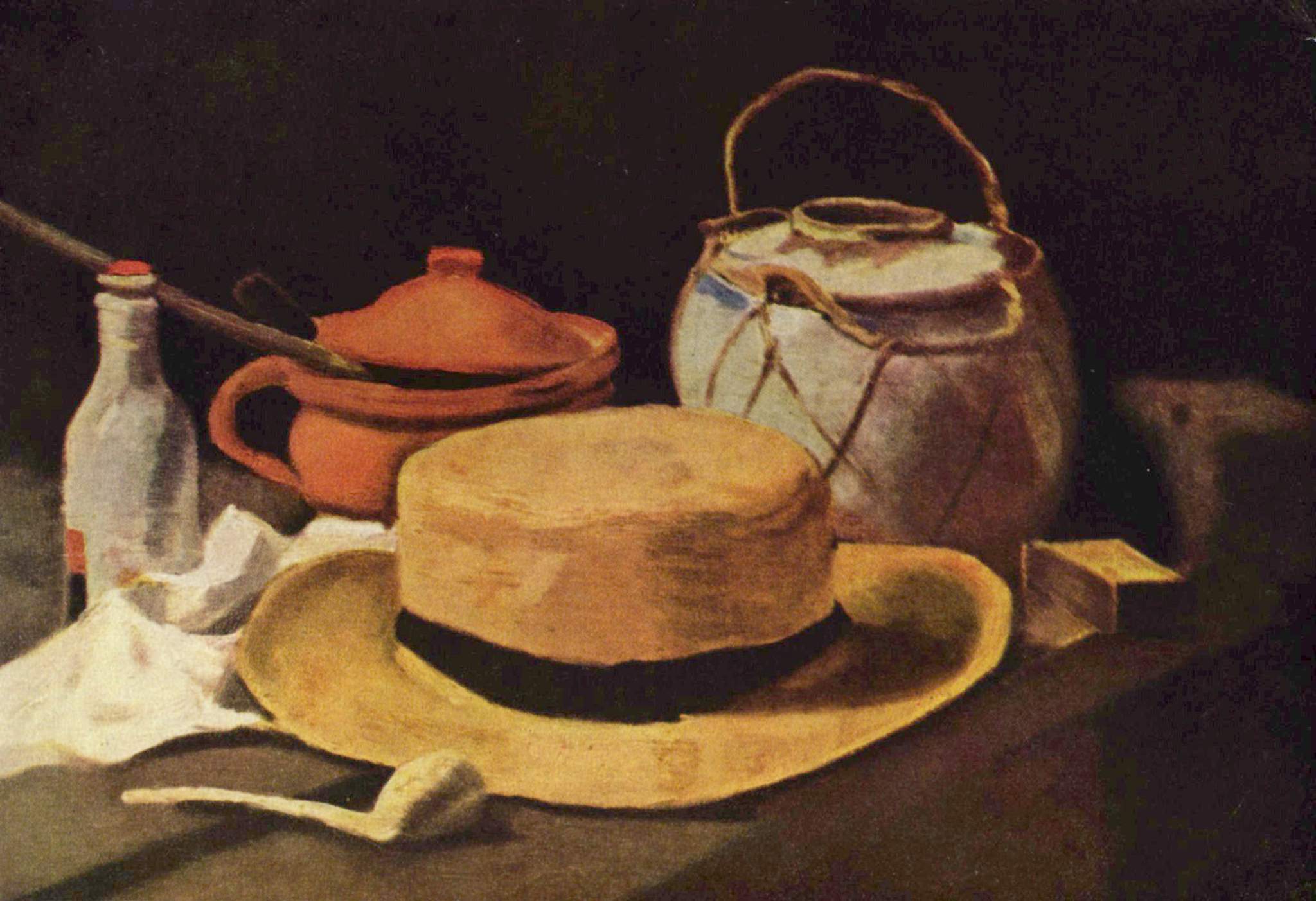
this piece is called "still life" and its by Giorgio Morandi. i chose this piece because it seemed to combine various elements of art that we have been studying. you can see in the top corners there are vertical lines of varying shades.
now that i look closer to the background i can see that there are different shapes within all the shading. they look like flowers to me, not sure though, its difficult to tell. there are even more shapes or designs in the shading closer to the bottom of the piece. very interesting idea. i wonder why morandi did this.
i especially think the contrast between the top part of the piece and the bottom part is interesting. it goes from light to dark which i think is cool. he does this as well with the two taller bottles in front of the basket. one is lighter than the other. i also find it interesting that he chose a tall and hourglass shaped bottle and have it next to another tall, but wider based bottle that is lighter in shade. then next to the basket theres a short bottle with a wide base. http://www.moma.org/collection/browse_results.php?criteria=O%3AAD%3AE%3A4079&page_number=4&template_id=1&sort_order=1
Blog Posts for This Week
I would like for everyone to look at still life for their blog post this week. Some artists to consider for still life are Georges Braques, Matisse, Dutch still life in general (from the 16th-18th c), Picasso, and Jean Simeon Chardin. Still life is a prevalent genre of painting in Western art with a rich tradition, so many of the artists you come across will likely be from the 16th-19th c, which is just fine for this assignment. Let me know if you have any problems.

Example:

Jean-Simeon Chardin, La Raie, 1725-26
Wednesday, February 24, 2010
butterfly
i really liked this drawing by Mark Grotijan one becasue of the use of color and how 3d it looks but because it is his differents takes on the butterfly. I always find it amazing how someone can take something and draw what they see and it willl always be completly diffferent then what someone else sees and then composes. the picture seems, even though it was drawn, that you could reach out and touch it. that it is real and protruding from the wall. 

Tuesday, February 23, 2010
Portrait of a Man - Diego
This line drawing by Alberto Giacometti caught my eye because of how sloppy it looked. The lines look as if they were drawn very quickly. Areas where a lot of these lines overlap are darker, adding contrast and depth. Giacometti didn't seem to focus on the shoulders very much but on second thought this was probably done on purpose. The focus of the piece is the face and the different line strokes used to depict those features and if a lot of lines were used for the shoulders, it might take the focus away from the face. Instead Giacometti uses long straight-ish lines to give the shoulders an outline and the rest is left to the imagination. I really like these types of drawings and seeing this piece by Giacometti showed me new ways of branching away from representational drawing and more towards using different line qualities to let the brain interpret shape and depth.
I really admire the room filled with pictures of the boy who had a tumor and his mother's journey as she tried to be there for him through every moment of his life. All the pictures were black and white, as I recall, and it was easy to see outlines of the people and the boy's stick-like arms whenever he and his mother were hugging or when she was racing his wheelchair down the hall before his chemotherapy treatment began. this was a very powerful exhibition, it takes inner courage to document moments of someone's life like that and put it up on display. I was truly touched.
Due Friday, 2/26
For Friday's class, I would like you to bring in a set of at least five objects that are thematically connected. We will be using these objects to create a class still life (only for one class period-- you will take the objects back with you at the end of the session). Try to bring in a variety of sizes of things that fit within your theme. For example, if your theme is "things that are shiny," rather than bringing in five gum wrappers, bring in a large shiny pinwheel, your new bicycle, a mirror, a disco ball, and an irridescent porcelain cat. Just an example. Other ideas for themes are "things that are made of glass," "things that are rough," "things that are soft," "things that are organic," -- you get the idea.
Monday, February 22, 2010
Last Wednesday was the first time i entered the Samuel Dorsky Museum and it was a fairly interesting experience. As you first walk in you see many different types of artworks from paintings to ceramics etc. Then as you make your way towards the back left one would see a whole gallery of photographs of this one child. When walking in and seeing the photographs the pictures had meaning to it. Every little detail was taken into account by the artist.The photographs go in order from day one to the last day the boy was alive. This was pretty interesting because it was not only one picture it was like the pictures told a story and the art had meaning to it.
Furthermore, the pictures were all in black and white which I found to be pretty interesting which may have been done for several reasons by the photographer. One could possibly be because he wanted everyone to look the same and color didn't matter in these pictures. In addition some of the pictures were very graphic and stimulated the viewers attention as you saw pictures of a small child with a huge tumor in his stomach. All in all I thought the museum was fairly interesting and I enjoyed strolling through it.
Furthermore, the pictures were all in black and white which I found to be pretty interesting which may have been done for several reasons by the photographer. One could possibly be because he wanted everyone to look the same and color didn't matter in these pictures. In addition some of the pictures were very graphic and stimulated the viewers attention as you saw pictures of a small child with a huge tumor in his stomach. All in all I thought the museum was fairly interesting and I enjoyed strolling through it.
friday after class was my first time actually going inside and take my time looking at evrey piece carefully. the museum had many interesting art work but the one that really got my attencion out of all of them was "A Mother's Journey" by Renne C. Byer i really like how the photos could really tell the story and show so much emotion. i really like that piece over evrething else because i couldnt finish seeing all the pictures and reading the story. It was really sad i had a friend tell me the rest of the story. Also i agree that that really shows the reality of what many people go thru with loves ones who have cancer.
"A Mother's Journey"
When I was in the Dorsky I saw some great art, especially a piece in the permanent collection by Alberto Giacometti called Untitled. I really loved the photojournalism exhibit a little more. The reason is because some of the photographs were sweet and some of them were uncomfortable. It was not even the subject matter (such as the obvious hospital setting visual) so much as the angle, lines, and depth of the emotion taking place. There was one photograph in particular, I think #3 from the left. I believe it was when they were in her vehicle and she was on her cell phone(?). Anyway, the angle made me feel like I was intruding in the lives of these people.
Additionally the expressions on the faces both of the mother and the son were intriguing because sometimes he would be happy and she would be worried, or vice versa. It's also interesting because you would not think that photojournalism can have as much of an impact as a traditional piece such as Untitled by Giacometti, but it can, because of the method used when the photographer was taking their shots. They seemed very unplanned and spur-of-the-moment but yet deep, meaningful, and well thought out. I don't even remember the storyline as clearly as I remember the emotions evoked by the mother and her son on their journey through his illness and to his death.
Additionally the expressions on the faces both of the mother and the son were intriguing because sometimes he would be happy and she would be worried, or vice versa. It's also interesting because you would not think that photojournalism can have as much of an impact as a traditional piece such as Untitled by Giacometti, but it can, because of the method used when the photographer was taking their shots. They seemed very unplanned and spur-of-the-moment but yet deep, meaningful, and well thought out. I don't even remember the storyline as clearly as I remember the emotions evoked by the mother and her son on their journey through his illness and to his death.
Subscribe to:
Posts (Atom)