Friday, April 23, 2010

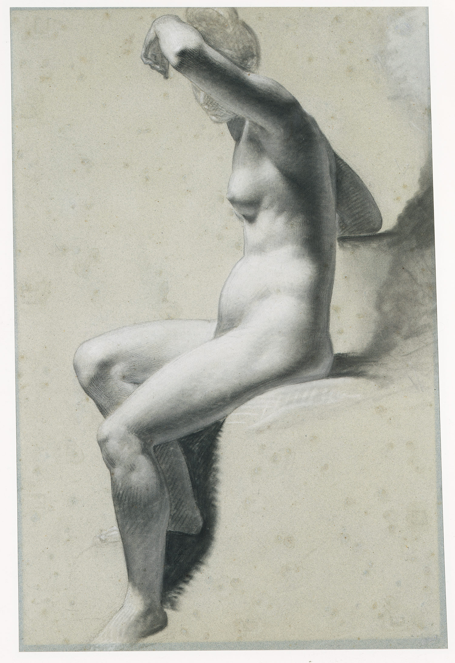
Seated Female Nude by Pierre-Paul Prud'hon


I like how the subject and the background don't vary in color or depth. She's covering her face with her arm which is darkened by shadow that follows down from her elbow all the way down to her feet. These features make her seem mysterious or shy.

Thursday, April 22, 2010


The fresco is a part of Sisteen Chapel ceiling paintings created 500 years ago. Michellangelo and Da Vinci were among the first artists whose paintings depicted nude bodies. Michelangelos interest and knowladge of human anatomy is visible and the details are transfered into his work.

The Vitruvian Man


This drawing done by Leonardo Da Vinco in 1485 on paper using ink is a perfect example of figure. Da Vinci focused mainly on proportion in this drawing. The notes written in mirror writing are Leonardo's descriptions of the proportions of the human body. The superimposed images of the body in different positions and the geometric figures that surround the body show how perfectly proportioned the human body seems to be (an example being the outstretched arms and the square that is formed with the height of the body) Throughout the drawing there are markings that show where Da Vinci used reference points to correctly proportion the different parts of the body. The drawing shows Da Vinci's attention to detail and meticulous craftsmanship as every part of the body is drawn according to a very specific ratio. (i.e. - a palm is four fingers wide, etc...)

Pablo Picasso


I chose this piece because Picasso’s pictures are different from other artists. Unlike other artists, he viewed and drew objects differently, like abstracted pictures. There are five nude women in this piece who were partially draped in white sheets, stared out of the painting at the on looker. Their bodies have been flattened, making them sharp and angular which looked kind of aggressive. Besides the two figures in the middle, their faces look as if they are hidden behind masks, having been disfigured by the bold blocks of color and shading. When I see this piece, its looks sharp and violent. But the flow of the white and blue material makes the scene feel a lot calmer. People may dislike when they see this picture but to me, it attracts attention.

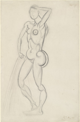
Figure Drawing


http://www.moma.org/collection/object.php?object_id=35294

"Figures on Blue Construction" -Bill Traylor


When i first took a glance at the thumbnail image for this piece i thought the item in the center was a blue "ET" that had arms extending out. This got me interested so i clicked to open the full page. I then saw the full sized image and noticed that the "ET" i thought i saw was actually some sort of object these other figures were building (or so it looks like they are building something..the figure on the top left seems to have a hammer or some tool in his hands).

I like that as you look at more and more of the piece you find something else. For example the legs of the table are drawn and almost look like human legs/lower body.
I think this is one of the most beautiful drawings of the human form I've ever seen...as seen from the back :) I love the way you can almost see the muscles ripple beneath the skin in movement. Everything is in proportion and the shadows show exact depth and curves. Michelangelo is awesome!

Wednesday, April 21, 2010

Bather

This image really took me back when i first saw it. I didnt see that it was even a work of Picasso at first. What i seem to really like is, he takes a basic drawing meathod and then escapes into a altered sence of what the human body looks like. There are overly dramatic muslces that seem very masculine, but then there are very intentional feminine features. the breasts, lower stomach, and butt, are all put there because he strongly is saying this is a woman. I think the style, obviously is his own, but also remindes me of the roman stlye of drawing women. The main part of the body to concentrate on is the lower half, and reproductive area. I dont think this is not done on purpose. The flow of the drawing is fluid as well, it almost seems as if he never takes his pencil off the paper.

Tuesday, April 20, 2010


Alex Grey is known for his unusual subjects and use of vibrant colors. In this piece, he obviously uses many different colors on the spectrum. His use of contrasting colors in the background makes the yellow "sun" area really stand out as a halo around the body. The mostly analagous colors in the body look similar, but still pop out against each other and then the contrasting colors make all of the arteries and bones and such stand out in such a way that they almost seem real. I think that this piece is overall very successful and makes me want to look at so many more of his paintings, though I've already looked at most.

What's Due Friday?

Here it is in list form; all that is due Friday 4/23:

- Bring one (or more if you have extras) road map that you do not mind destroying (the map must be paper, not plastic, and not a computer printout)

- Bring unexpected drawing materials

- Bring an Xacto Knife and cutting mat (you may also bring several thick pieces of cardboard in lieu of a cutting mat, and a box cutter in lieu of an xacto knife, if you have one)

- Three 10 minute figure drawings (10 minutes spent on each drawing) : these should be full body poses--- please do not bring drawings of someone's face

- Post on the blog : one piece that features figure drawing prominently


I just googled "color paintings" and this one caught my attention. It is by Steven Pollard, Ph.D. who practices in Hawaii and apparently it is part of his therapy to have this done. In his statement it says he does therapy with others in his art. He says it helps them look at their lives differently. He lets his unconscious do the art, with no preconceived notion. As far as my own perspective, I can see the rich emotions that would be perceived through the use of the colors and the randomness yet structure to the lines that go through the painting. There is a rich variety in texture. The medium he uses is first digital painting in Adobe Photoshop and Corel Painter IX then he prints the digital canvas and adds to it on a canvas with real paint. love his unique approach of incorporating graphic design AND traditional art. It gives a different idea of what traditional art can be.

Artemesia Gentileschi, Judith and Holofernes


This is a painting by Artemesia Gentileschi called "Judith and Holofernes." I love the way the woman's face tends to blend into the shadows of the background and the incredible expressions. Both women seem as though they're just cutting off a piece of bread, rather than a man's head, and the background is practically absorbing the features presented in the light. If you draw a line between the woman's head (the one furthest to the right, the man's shoulder and his knee, you will see a triangle that is perfectly centered on canvas. The light hitting the folds of the mattress is so soft and the colors used are so rich... it just makes the whole scene all the more terrible and beautiful. The movie was excellent too, by the way!!


Painting Title: Cafe Terrace at Night 1888Oil on Canvas, 81 x 65.5cm - 31 x 26 Inches (approx)Vincent van Gogh
The title of this painting is “Café at Night” and done by Vincent van Gogh. In his paintings, sometimes a touch has a color. I mean we can see the touch of the brush easily. I think that gives us very strong feeling. In this painting we can see them on the street. Its blocks and the lights expressed with yellow and dark lines. His yellow and blue with white and black work really strong in many of his drawings. I think his green makes the painting more natural between strong contrast of yellow and blue. In this painting, yellow hold my eyes first and the white stars in the sky and the tables make the whole work harmonious.

Monday, April 19, 2010

Le Bonheur de Vivre


This painting was completed by Henri Matisse in 1905. The title translates to The Joy of Living. There is a yellow undertone that gives the entire piece a sense of warmth and lively energy. Matisse uses oranges and reds heavily on the upper left side and greens on the upper right side. The complementary colors and the underlying yellow reflect the optimistic title and give the painting a pleasant atmosphere. The expressive figures also reflect simple joys of living which include music, dancing, friendship, sex, and even solitude. Matisse uses red to guide the viewer across the painting starting from the nude woman on the left to the figures conversing in the middle and finally to the lonely figure by the goats. Red is a high energy color often representing passion and green is a low energy color often associated with tranquility. Matisse's use of both of these colors to halo the two center figures could be his way of expressing that enjoyment can be found anywhere, from high energy passionate moments to relaxed passing moments.

Maurice de Vlaminck - Restaurant de la Machine


Maurice de Vlaminck
Restaurant de la Machine a Bougival
1905


The oranges/blues in the street and the reds/greens in the garden are great examples of both complimentary colors and analogous colors. I like the fact that the painting is completely swallowed by so many different vivid colors; it is so vibrant and full of energy while the little touches of white make it delicate. I think we can all be attracted to this one today because the weather is getting warmer and the trees are getting brighter and fuller and this is a portrait of a perfect summer day.

Air & Space

I choose Air and Space by Jim Drain. It was done with felt tip pen and cut and pasted paper. Chromogenic color print and synthetic polymer paint. I like the use of analogous color and complimentary. I think the painting it self is very interesting. these huge pops of color "stars" that are almost like a fireworks show. then the picture has this surprising element of a face in the top right corner, and what to me is very interesting is that the face has no color or is monocromatic. then on the left side of the canvas i see all black. this is almost like a sky that these firewroks are receeding from. I feel like this painting is telling an intimate story, perhaps of a girl lost or overpowered by something, it just has a very amazing way of grabbing the viewer and not letting go,

Self Portrait 1967

This self portrait by Andy Warhol is an example of an abstract art. Warhol was famous for often using his own image in his work as well as the portraits of many other celebrities. Many times he used the same image only changing colors to create an array of self portraits.
I saw this particular piece also in black and red.
He was a shy, non communicative person and while I was reading about him I found a quote which I liked: " If a mirror looks into a mirror, what is there to see?"

Portrait of Madame Matisse


I chose this piece because it is an abstracted portrait like we did in the class. This piece is drawn by artist named Henri Matisse. He was one of the leaders of Fauvism (Artists who used strong color over the representational or realistic values retained by impressionism). I like this picture because it looks like he described this lady's personality using warm and cool color. By putting the green line or stripe in the middle of her face, the artist divided the face with cool and warm side. When I saw this, I feel the energy/power of this lady, but also calm side of her characteristic. Also, it looks like there is contrast in this picture. Left side of her face looks smooth but right side of her face looks kinda rough.

Sunday, April 18, 2010

Colors Post


I like this piece by Jackson Pollock which is called One: Number 31,1950 because as with all of his other works, they can be interpreted in many different ways. Anyone can look for a specific color, think they found it, then someone else can have a different opinion about that same color. there are so many colors all thrown together that there is no correct answer. While in this piece it looks like there is a lot of black and white, if studied closely one could see some yellows and what appears to be dark greens. I wonder if when Pollock was making his pieces of work he had a certain plan of what colors he would use and when. I know that he would just fling paint onto canvas, which i think is a unique and pretty cool style of painting, but i wonder if he tried to get certain colors to appear in certain areas or if he wanted more of the paint to land in a certain part of the piece.
http://www.moma.org/collection/object.php?object_id=78386

Sunday, March 21, 2010

What's Due and Project #2

Hello All!
I hope you've had a great spring break! I have a couple of reminders for the next class. First, please bring the drawings you did during the last class (on the gray paper) to Tuesday's class. Next, please make sure you bring the digital files along with a paper print out of your self portrait. Also, all make up assigments are due Tuesday-- I will not be accepting them after this date. Below is a written description of Project #2, which we will begin on Tuesday.

Project #2 : Self-Portrait Diptych

Part 1 : Representational
This portion of the assignment will be in black and white. Compose a self-portrait of either your face and shoulders or of your entire body without your face (cover your face, look away from the camera, take the picture from behind, etc.) Have a friend take the picture of you and print it out on an 8.5" x 11" piece of paper. (The image should cover most of the piece of paper). Bring a digital copy of the image to class on March 23rd -- we will look at the images in the computer lab and play with altering them using photoshop. Using pencil, grid the self-portrait onto an 18" x 24" piece of paper (this will be provided to you).

Part 2 : Abstracted
You will be using color for this portion of the assignment. Using a distorted grid of the same image from part 1, copy your self portrait to another 18" x 24" piece of paper. Think about what colors represent the aspects of yourself that are central to your self-portrait.

Thursday, March 11, 2010

In Your Workbook

As listed in the syllabus, your workbook (also known as your sketchbook) is worth 10% of your grade. I will be grading your sketchbooks on Friday during your progress reviews. I will be looking for the following:

-6 distinct shades of gray created from hatching and cross hatching (we began this in class on 2/2)
-Rule of thirds (assigned in class on 2/12)
-5 mock-up sketches for project 1 (due 2/12)
-final mock-up sketch for project 1 (due 2/15)
-2 half hour still life sketches of thematically related objects (due 3/2)
-1 hour sketch of thematically related objects (due 3/2)
-printed picture (as in taken with a camera) of the objects you used in your at home still life due 3/2)
-4 still life drawings done from nature (2 in class, 2 out of class -- due 3/12)

**All of the above homework has already been given to you, and as such should already be completed. None of the above is intended to be new to you in any way.**

Reminder: You must also bring all the work we've done in class. This includes all the contour drawings, subtractive drawings, composition exercises, etc. -- if you drew it, you should bring it.